Stamp Design: How To Do.
Please note: This is current on hold.
If you are a member of the Elsewhere Philatelic Society, you of course realize that one of the highest callings of someone well-versed in philatelicism is the actual designing of actual, actual stamps. Now you have this opportunity. It is a wide vista; do not let its potential vastness consume you with sleepless nights and dizzied days. Vanquish the self-doubt it is a delusional illusion. You can do this.
What you send to the EPS should be flat. If you design a 3D thing, you should take a photo of it with a nice white or black background that brings out its essential features. Please turn in only one stamp design. Here are some suggestions for stamp designs:
- Collage
- Photos you have taken
- Collage of photos you have taken
- Drawings
- Sculpture (take a photo of it)
- Drawing of a sculpture
- Photo of a sculpture of a drawing
- Bricolage
- Crafts
- Etc.
Your stamp design, no matter the shape, will end up as either a rectangular or square-shaped stamp. That is where we all are right now. So your best bet is to optimize for one of these two shapes. You can make an absurdly long or wide rectangle, the ratio of width to height does not matter. BUT. If you are drawing, sketching, noodling, what-have-you -- GO BIG. Stamps are small, but we have shrinking technology. If you turn in a physical copy of the stamp it should be at least four inches long on its shortest side. The size of the image should also be no greater than 8 inches by 10 inches.
You can use full color, or black and white, shading, halftones, etc. Shading and halftones can sometimes turn into puddles of goo when reduced.
Don't draw with pencils. Or, if you'd like: draw with pencils, "ink" it in with a pen, then erase the pencil marks once it's dried.
Make sure you are happy with the finished artwork. Shrink it down on a copying machine to about 1.5 inches on a side to get an idea of what it would look like being all small like that. But that is for your eyes only; send along the full-size artwork. Definitely do this test with anything that has fine lines, or a lot of "op art", cross-hatching, halftones, shading, many areas of contrasting color, checked suits, moire patterns, butterscotch flames, halftones, dippity-do, or tiny print.
What should it look like? That is up to you. It is your stamp.
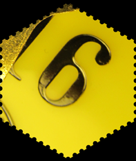
Ideally, anything you send should be a copy of your original artwork, in case something goes astray in the mail service. It has happened. You can send files to mail@starteleweb.com as well. The subject line should read "[stamp design]" so it is routed properly. Important: do not put any designs along the border -- like stamp perforations etc. It should just be the raw image. Printed stamps will have a white border around them. If you want to have an additional non-white border around the image, then by all means, include it, but please indicate that you would like to keep the border.
RASTER IMAGES: If it is raster, please send the file in the PNG or TIF format. The image should be at least 1200 pixels on the shortest edge.
VECTOR IMAGES: If it is vector, please send it in the PDF format. Make sure fonts are included / outlined if it is a PDF file.
After you have sent your work in, an unspecified amount of time will pass, and then you will receive something in the mail. Which means, no matter if your submission is through email or regular mail: send along your preferred mailing address. You can then distribute your stamps to other EPS members.
YOUR STAMP DESIGN CHECKLIST:
- GO BIG!
- Rectangular or square
- No pencils
- Double-check the art after testing size reduction
- Send a copy, not an original!
- Send your name/address with your submission
- Via regular mail (P.O. Box 411553 SF 94141) or email (TIF PNG PDF; subject: [stamp design])